5 Essential Design Principles Every Website Owner Should Know
Creating an effective website goes beyond just having great content. The visual design and user experience play crucial roles in determining whether visitors stay, engage, and convert. Understanding fundamental design principles can transform your website from ordinary to exceptional.
1. Typography: The Foundation of Communication
Typography is more than just choosing a pretty font. It's about creating a hierarchy that guides readers through your content effortlessly. Your website should use no more than two font families – one for headings and another for body text.
Consider font size, line spacing, and letter spacing carefully. Body text should be at least 16px for optimal readability, with line height set to 1.5 or 1.6. This creates breathing room that makes your content more digestible and professional.
Sans-serif fonts like Inter, Roboto, or Source Sans Pro work exceptionally well for digital interfaces, offering clean readability across all devices and screen sizes.
2. Color Theory: Creating Visual Harmony
Effective color schemes don't require a rainbow of hues. The most impactful websites often use monochromatic or near-monochromatic palettes. Start with a primary color and build variations using different shades and tints.
High contrast between text and background is essential for accessibility and readability. Dark text on light backgrounds or vice versa ensures your content is accessible to all users, including those with visual impairments.
3. White Space: The Power of Nothing
White space, or negative space, is not wasted space – it's a powerful design tool. Generous margins, padding, and spacing between elements create a sense of elegance and make your content more scannable.
Use white space strategically to group related elements and separate different sections. This visual breathing room reduces cognitive load and helps users focus on what matters most.
On mobile devices, ensure minimum 20-40px margins, while desktop layouts should have 60-80px or more. This approach creates a premium feel and improves user experience across all devices.
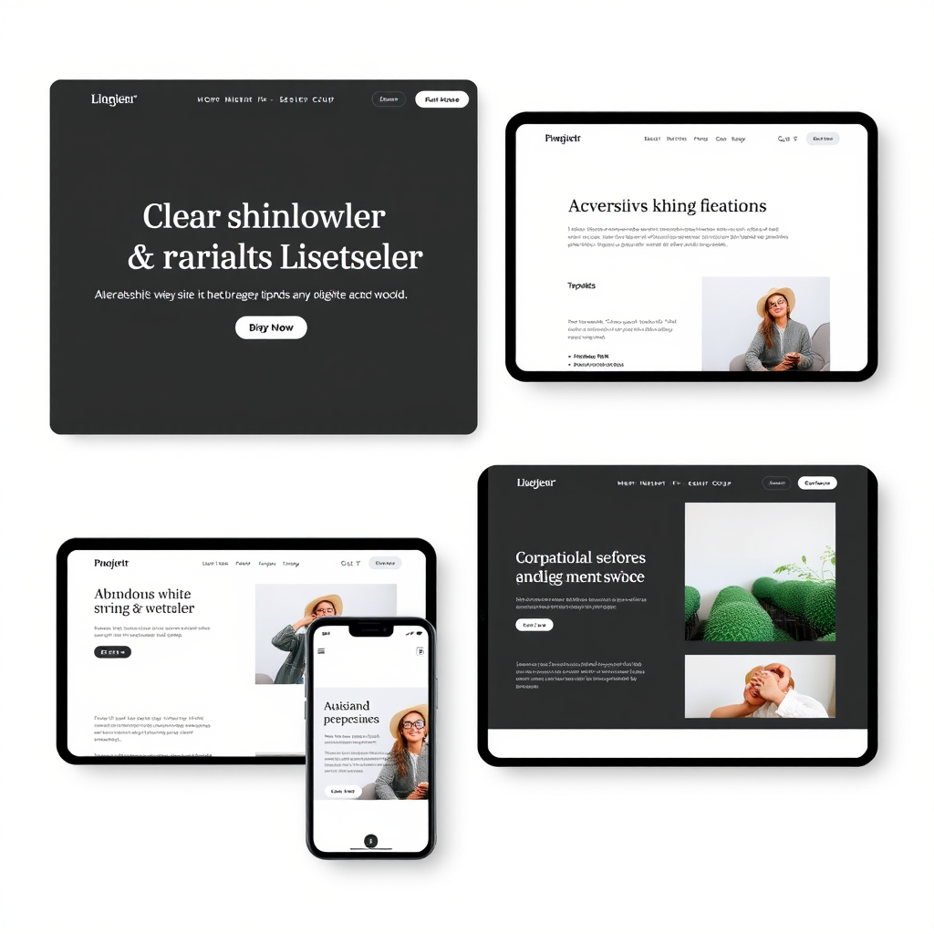
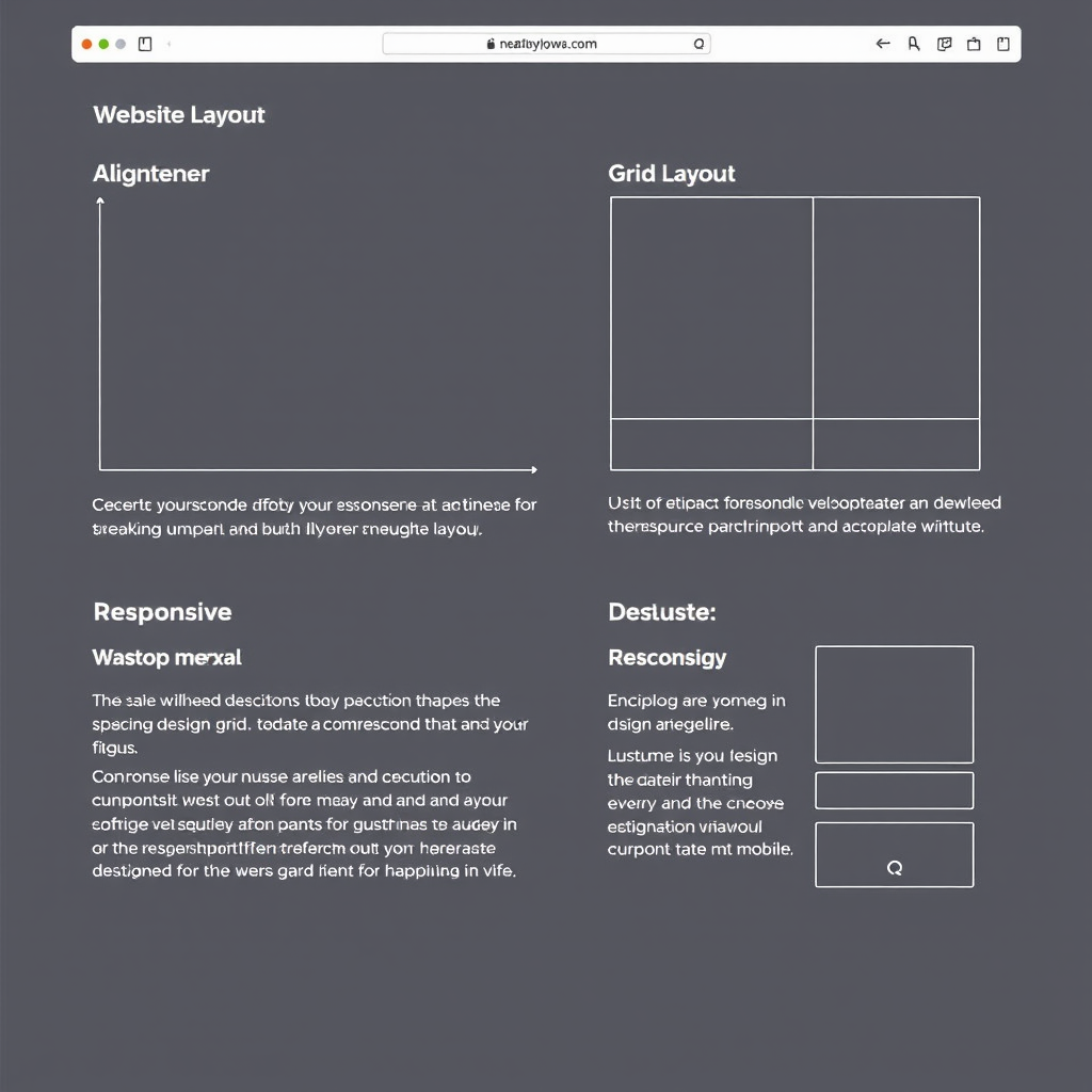
4. Layout Optimization: Structure That Works
Grid-based layouts provide structure and consistency. Use a systematic approach to align elements and create visual order. Single-column layouts often work better than complex multi-column designs, especially on mobile devices.
Maintain consistent spacing intervals throughout your design. If you use 20px spacing in one area, use multiples of that measurement (40px, 60px) elsewhere. This creates visual rhythm and professional polish.
Consider the F-pattern or Z-pattern reading behaviors when placing important elements. Users typically scan content in predictable patterns, so position key information accordingly.
5. Visual Hierarchy: Guiding User Attention
Visual hierarchy determines the order in which users process information. Use size, weight, color, and positioning to create clear information priorities. Your most important content should be the most visually prominent.
Limit yourself to 3-4 hierarchy levels to avoid confusion. A clear progression from main headings to subheadings to body text creates a logical flow that users can follow intuitively.
Achieve hierarchy through typography and spacing rather than decorative elements. This minimalist approach creates sophistication while maintaining functionality across all devices and contexts.
Implementing These Principles
Start by auditing your current website against these five principles. Identify areas where improvements can be made without overwhelming yourself with a complete redesign.
Focus on one principle at a time. Begin with typography improvements, then move to color optimization, followed by spacing adjustments. This systematic approach ensures sustainable progress.
Remember that good design is invisible – users should be able to navigate and consume your content effortlessly without being distracted by design elements. The goal is to enhance your message, not overshadow it.
Test your changes with real users and gather feedback. What looks good to you might not work for your target audience. Continuous refinement based on user behavior and feedback leads to the most effective results.
Key Takeaways
- Typography creates the foundation for all communication on your website
- Monochromatic color schemes often outperform complex palettes
- White space is a design element, not empty space to be filled
- Grid-based layouts provide structure and professional appearance
- Visual hierarchy guides users through your content naturally